I worked collaboratively with a team to make this mural for the Visual Arts department. We also came up with the design for it as well, with some inspiration from Si Scotts work. The only colour we used was black acrylic for the whole board, we made it look like it has depth by fading out the black acrylic. We then sprayed some blue ink onto it to brighton it up, I think it adds effect to it but could have been sprayed over more of it to make it look more effective than just patches.
Tag Archives: black
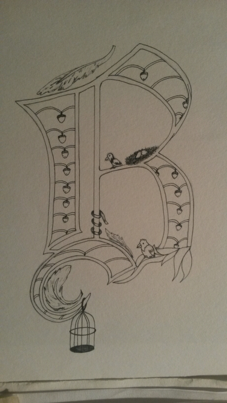
Alice Stanne inspired letter
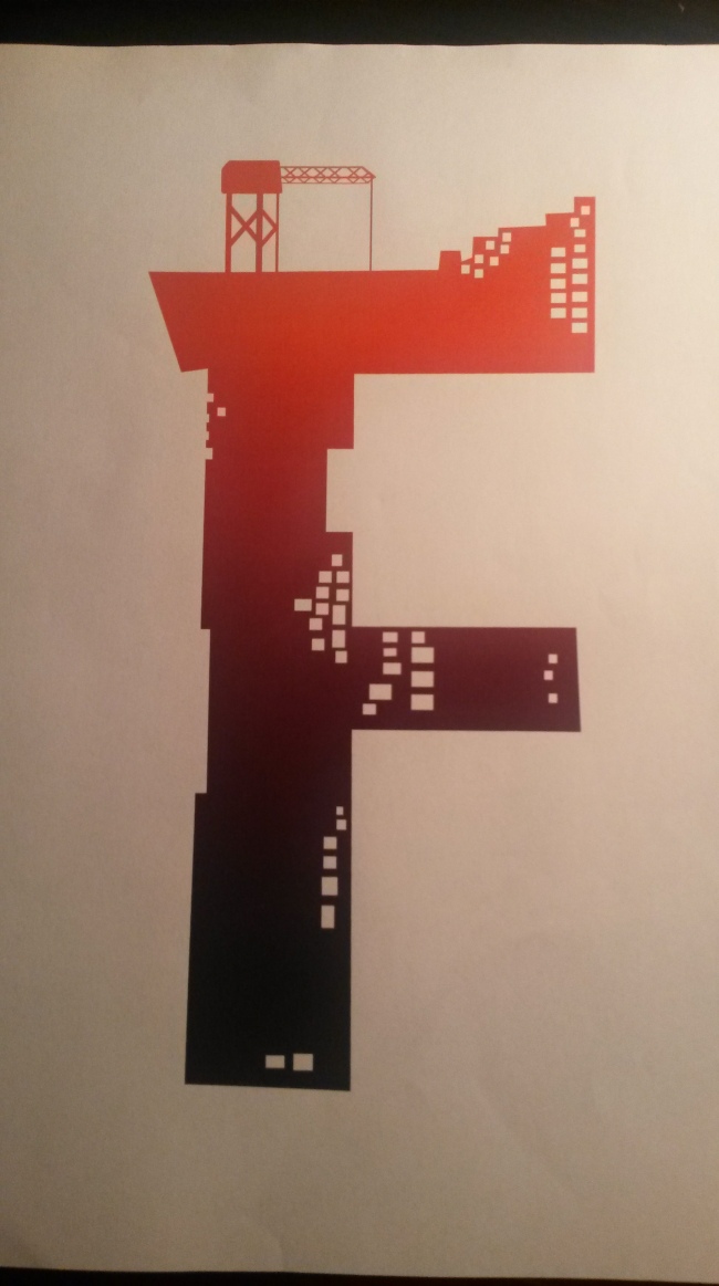
44 Flavours inspired letter
44 Flavours have a range of different styles but I chose to do it in the style of one of their Zoo York Inst. t-shirt designs. I made this letter on illustrator. I started off with the letter F then I cut squares from it to make them look like windows. I then added a crane on top of it and I also extended some of the lines on the letter, finally to finished it I added a gradient. 
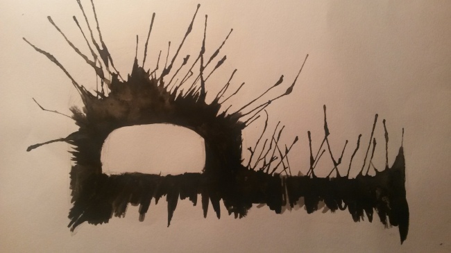
Craig Ward inspired letter
Ian Murphy Impressions
Vince Low Impression

This is my impression of Vince Low’s work. He uses swirls and curved lines to make his work, he usually draws portraits but I chose to do a lily instead. I drew more compact swirls for the darker areas then more loose swirls for the lighter parts. I then just added curved lines going off the lily to complete the image.


